Fake Characters

Inspired by work done by Phonethics, I also thought I would create some characters. And some lives. Here is the first draft.

Koncious Kapoor

KK is our typical metrosexual Indian. He belongs to a very small time in UP and his is the first family to have stepped out of their town. They hence have an elevated status amongst their peers. Kconcious Kapoor has studied in a boarding school and although he has a modernish outlook towards life, he is still conscious of his background and upbringing. Like any typical young Indian, he wants to get rich quick, become famous and is really scared of facing an audience.

Khoob Bai

Everyone knows that KB is 35ish, claims to be 25ish, looks 30ish and is 45ish in real. She does everything including cleaning utensils, scrubbing floors, acting as the informal communication channel between young lovers, delivering gossip and obviously peeping on personal affairs of her employers. She knows more secrets than the FBI, CIA, RAW, The Mossad, MI6 and KGB combined. And she keeps dropping hints about her (in)famous access to information. She promises her loyalty to everyone but she is loyal to only one thing – money.

Totaram Sharma

better known as Sharma Ji in his colony and Sharma Babu in his office. He is a struggling middle aged government employee who has been a clerk since last 30 years and has seen two salary hikes and one promotion. He is a perpetual landmark on his office canvas. All the kids in his colony hate him for his never ending cribbing about noise and ruckus that these kids make. He has two teenaged daughters that add to his agony in life. He is also known for speaking for hours without making any sense at all.

Toofan Kumar

is in a perpetual state of hurry. He is rushing for something or the other. He even talks as fast as he walks. Folklore has it that he was last seen relaxing when he was standing in the visa queue to US of A. He thinks that world today is full of opportunists and he needs to do something about it. He feels very passionately about all the popular social causes and actively participates in debates around these. Motive is not to save trees or prevent child abuse but to pave a road for his political dreams. And of course the visa was rejected.

Happy Singh

is a typical surd. Happy go lucky, content and hungry – all three at the same time. Thanks to his beard, no one knows where his smile begins and ends. Or if he is smiling at all. He is on the heavier side and has an insatiable appetite. Every time he sees a cow, goat, chicken or any other animal of edible quality, his hunger pangs strike him. He is still single with no immediate plans or chances either. His family lives in Ludhiana and thus he has all the money he needs to live comfortably without working.

This has potential to become a huge business by itself. Not on the lines of what Phonethics is doing but something else. Keep watching.

Ceat, Shoppers Stop and Godrej Rebranding stories

Three very big Indian brands have gone for a makeover. Godrej, Shopper’s Stop and Ceat. Before I get into a long rhetoric on these individually, I think except Godrej, Shopper’s Stop and Ceat have got it wrong.

Godrej Industries Ltd.
Godrej has added colors to it age old logo. Shoppers’ Stop and Ceat have completely changed their looks. Also, Shoppers’ Stop says “Change is Good” and Ceat says “Change is here”. I wonder if both these have been created by same team?


Godrej the behemoth that sells everything from shoe polish to animal feed to almirahs to locks to lavish food for rich to real estate to a lot of things unimaginable has got a new look. They did not do anything drastic. They retained their logo. Added some animation, color and jazz to it. As a customer I love what they have done. For me I have grown up in house where we had tons of Godrej almirahs and locks and for me Godrej means trust. Is the new look enhancing that? No it does not but it gives me a sense that owners are trying to reinvent the old company and are committed about it. And since And are they doing it because a Godrej Properties is planning to come with its IPO?

Shoppers Stop
Coming on to Shopper’s Stop, its is a chain of premium retail megastores. They sell clothes, accessories and other fancy things that riches and the great Indian middle class buys. In fact they are amongst the first players in Indian retail industry to have experimented with large format stores and organized retailing. Their earlier logo and identity was very classy by Indian standards and for the last 10 odd years that logo has been itched in the minds of the customers. It had everything a premium brand’s logo should have – curves, stars, symmetry. It was very very appealing.The new logo is anything but premium and yet is a good piece of work on a stand alone basis. But moment you compare it with older logo (and comparison is inevitable), it looks dull. It looks like someone has stepped back in time. To start with it is plain text in a font that can be used by anyone and everyone. A plain text logo could have been good if you added colors, gradients or other elements to break the clutter (hint Godrej). But that too is missing. I think they wanted more serious and elegant look for the brand and the logo has failed to deliver that. I would say this was created by an amateur designer trying random text layouts.

I have no clue what warranted the need for a change in logo. I understand that Shoppers’ Stop is coming up with an IPO but did it require a change in look?

Ceat Tyres
Ceat is one of the oldest tyre manufactures in the country. Its a publicly traded company and although I have not had any interactions with their business (never purchased a ceat product), have heard a lot about them. The new logo looks like a half baked pie. Its like work in progress and first time I saw it, I could not relate it to the type manufacturer. When I read the headline, that was the time I realized that it was ceat they were talking about.

As a customer and as an observer, I like their earlier logo better. It had a meaning to it. I could see a rhino and I could conjure an image of a vehicle running on a ceat tyre negotiating hard curves. The new look might also have a road (the E looks like a road with a divider) but it fails to conjure any kind of imagery. Is there a trend in design houses to move towards plain text fonts with minimal use of colors? Or both Shoppers Stop and Ceat have been done by the same agency with a Creative Decision Maker believing that plain text is good and we should talk about change to go along with that?

Its often said an organization is as good as the decision makers it has. I dont really think design teams for both Shoppers Stop and Ceat have done their homework and tried to design a contemporary look. And they should consider the fact that people do not buy products or services. They buy and consume brands. And brand is something that makes the decision process for the consumer simpler. Not more complex by creating conflicting images in their minds.

Design, Advertising and financial markets may sound very different but there is indeed some kind of a relationship. Any more IPOs or redesigns coming up .. ?

P.S.: All the comments are not from an aesthetic point of view. I am hardly a person who has good design sense. I am talking from the perspective of a customer. I have tried to think how would a customer feel when he is interacting with a brand that is supposed to be premium.

All three companies trade on the stock exchanges and I own certain number of shares of Godrej Industries ltd. I might or might not choose to buy/sell these shares.

And I just realized that I am indeed passionate about brands and way consumers think abut brands. As a very good friend would say .. “Aha” moment of the day !

Tags: IPO, Indian Financial Markets, Godrej, Ceat, Shopper’s Stop, Retail, India, Design, Logo, Re-design, Advertising, Marketing, Branding.

Quote on Indian Consumers

The average Indian consumer is growing. The urban world is driven by aspiration, quality and value in that order, while the rural world is driven by the same factors in a different order – value, aspiration and quality. It’s funny they want the same things in different ways.

Shivkumar is chief executive officer, Nokia

Taken from AgencyFaqs.com

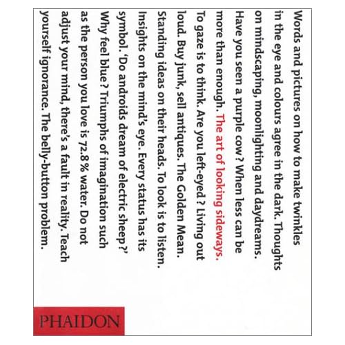
The Art of Looking Sideways


The Art of Looking Sideways is an awesome book by Alan Fletcher. I just bought a copy.

I had blogged about it earlier also on SaurabhGarg.com (on 13th Jan 2008).

This book should help me with a lot of inspiration about design, advertising, creativity, decision making and thinking. Looking forward to reading it.

And now this book becomes the second most expensive book that I have purchased after Still Reading SRK.

Other links
A vid on Youtube where Alan Fletcher talks about it.

Advertising online?

Adlab has posted this comScore press release on banner clicks. One of the most important observation is that

a very small group of consumers who are not representative of the total U.S. online population is accountable for the vast majority of display ad click-through behavior.

What does this mean for online advertising industry?
For brands: Advertising online might be a good idea but its still far from generating the revenues.

Disclaimer
I am using a study conducted in US to base my opinion on. This study might not be relevant in India.

Leo Burnett Speech – When to take my name off the door

Raj recommended this speech to us. And it is worth the time.

Somewhere along the line, after I’m finally off the premises, you – or your successors – may want to take my name off the premises, too.

You may want to call yourselves “Twain, Rogers, Sawyer and Finn, Inc.”.. or “Ajax Advertising” or something.

That will certainly be ok with me – if it’s good for you.

But let me tell you when I might demand that you take my name off the door.

That will be the day when you spend more time trying to make money and less time making advertising – our kind of advertising.

When you forget that the sheer fun of ad making and the lift you get out of it – the creative climate of the place – should be as important as money to the very special breed of writers and artists and business professionals who compose this company of ours – and make it tick.

When you lose that restless feeling that nothing you do is ever quite good enough.

When you lose your itch to the job well for it’s sake – regardless of the client, or money, or the effort it takes.

When you lose your passion for thoroughness … you hatred of loose ends.

When you stop reaching the manner, the overtones, the marriage of words and pictures that proudest the fresh, the memorable and the believable effect.

When you stop rededicating yourselves every day to the idea that better advertising is what the Leo Burnett Company is about.

When you are no longer that Thoreau called “a corporation with a conscience” – which means to me, a corporation of conscientious men and women.

When you begin to compromise your integrity – which has always been the heart’s blood – the very guts of this agency.

When you stoop to convenient expediency an rationalize yourselves into acts of opportunism – for the sake of a fast buck.

When you show the slightest sign of crudeness, inappropriateness or smart –aleckness – and you lose that subtle sense of the fitness of things.

When your main interest becomes a matter of size just to be big – rather that good, hard, wonderful work.

When you outlook narrows down to the number of windows – from zero to five – in the walls of your office.

When you lose your humility and become big-short wisenheimers…. a little bit too big for your boots.

When the apples come down to being just apples for eating (or for polishing) – no longer part of our tone or personality.

When you disprove of something, and start tearing the hell out of the man who did it rather than the work itself.

When you stop building on strong and vital ideas, and start a routine production line.

When you start believing that, in the interest of efficiency, a creative spirit and the urge to create can be delegated and administrated, and forget that they can only be nurtured, stimulated, and inspired.

When you starting giving lip service to this being a “creative agency” and stop really being one.

Finally, when you lose your respect for the lonely man – the men at his typewriter or his drawing board or behind his camera or just scribbling notes with one of our big pencils – or working all night on a media plan. When you forget that the lonely man – and thank God for him – has made the agency we now have – possible. When you forget he’s the man who, because he is reaching harder, sometimes actually gets hold of for a moment – one of those hot, unreachable stars.

THAT, boys and girls, is when I shall insist you take my name off the door. And by golly, it will be taken off the door. Even if have to materialize long enough some night to rub it out myself – on every one of our floors. And before I DE-materialize again, I will paint out that star-reaching symbol too. And burn all the stationary. Perhaps tear up a few ads in passing.

And throw every goddamned apple down the elevator shafts.

You just won’t know the place, the next morning. You’ll have to find another name.

Text from: CIAdvertising

IBNLive.com > News or Sleaze?

I have wanted to join theatre for quite some time. I entered a query on Google and was directed to homepage of Mumbai Theatre Guide. And right on the top was this ad from Google Adsesne.

The copy read

Watch the hot pics of Indian Women in the world on IBNLive.com Now!

Is the biggest and the best media house in India trying to sell it website by paddling pictures of Indian Women?

Imagine. IBNLive.com is the internet presence of IBN7 – part of TV18 group and a news channel that goes with the punch line “Khabar har kimat par“. I used to think TV18 is an awesome company. I am in awe of Rajdeep Sardesai and Raghav Bhal. I know competition on internet is huge but these small cheap tricks to get more visitors on a website will not take them very far. Are they winning medals for journalism by showing hot pics of Indian Women? Are they creating personal fortunes and big companies by selling soft porn?

Coming on to the other side of the issue, do these women know that their pics are being advertised? That their personal lives are being used by IBN to promote their website? If they don’t, isn’t this breach of their personal privacy? If they do know, doesn’t this amount to crime? Paddling soft porn? Ms. Sushma Swaraj are you listening/reading?

Can someone forward this to TV18 group? And specifically to Mr. Bhal and Mr. Sardesai?

Google and Publicis to share Resources and Talent

Adage.com has this interesting article about Publicis and Google. According to adage, Google and Publicis have agreed on talent sharing to design and develop new product and services. Talent sharing has been done in the past as well but there is more to this sharing than any other partnership.

In an interview to adage.com, Publicis CEO Mr. Levy said
1. “For a few months or a year, people from Publicis Groupe will be working at Google, and people from Google will be working at some of our companies”
2. “We’re bringing Google our knowledge of advertising communications, consumers and client needs. They’re bringing us knowledge of technology and the world of the web.”
3. “Google might develop partnerships with other agencies, and Publicis is free to work with other groups, such as Yahoo or MSN.”

Publicis is into advertising and communication and Google is in technology and web. How can these two companies benefit from talking to each other?

If you look deeper into the core businesses, Publicis is effectively into communication of benefits of existing brands and still deeper, creating the need for a new brand. Google on the other hand is in the business of providing information to users and enabling transactions between users and brands.

If Publicis was to get into a relted business, they would logically get into Google’s domain and if Google integrated backwards, it would go into Publicis’ territory.

More and more companies are willing to share information to design new products. Interesting times ahead.

2008: There is something in the air


Before the Macworld Expo this year, interesting banners were put up around the site. These banners read “2008: There is something in the air”.

Obviously no one knew what those banners were about.

Yesterday Steve Jobs did it again. He unveiled Macbook Air. The slimmest laptop in the world. Aptly called The MacBook Air. And the website is called Thinnovation.

It is not about introducing the thinnest laptop or fastest or latest. These things are trivial. It is about pushing the limits everytime you face challenge or an audience. It is about creating expectations and then living upto them.

And as they say, presentation is as important as the final product, in my humble opinion, no one can deliver better presentations than Steve Jobs. We should learn how to create hype around a product and make them cult.