the curious case of missing cases!

Sony Vaio Screenshot

ever since I have started writing, which is i think more than 15 years ago, i have always been very cognizant of the grammar and style and punctuation and other such things. of all the things, i was totally a sucker for punctuation. i learnt about commas full stops, exclamations and even ellipses. i ensured that watever i wrote, whenever i wrote, in whatever medium, i got my grammar correct. in fact i was so obsessed with it that i started judging people on the punctuation marks they used, or dint use, depending on the case.

but then one fine day my laptop stopped working. in lieu, my office got a Sony Vaio and like all products that are designed without a thought, steve jobs would have hated this laptop, this Vaio is a classic #fail. for some reason, the designers of this laptop decided to reduce the size of the shift key and made it as big small as the other keys are. as a result, people like me (who have learnt typing the hard way on desktop keyboards and who type really fast) find it tough to stop the stream of thought, look up for the shift key and then press it along with the required key to change the case, inset an exclamation mark etc. it hit my productivity and ideas harder than non availability of good music to help you think.

at first i coped up by typing things like i normally do – fast and without looking at the keyboard; And then run a spell check and get most of the cases right. but then it was wasting just too much time and since time is most precious commodity that we humans have, i decided to drop cases altogether till i get rid of this wretched Sony. the drop in case came not as an idea but as a reflex, a revolt against this badly designed laptop. Sony, are you listening? also, if you are, please note that conventions and norms such as qwerty order and placement of shift keys etc have been developed over the years and it takes time to insert a new radical change, like the size of the shift key. if you think customers would accept it, no they wont. sorry, you are mistaken. if i were the ceo or something, i would’ve asked the team that even dared to reduce the size to leave. you must do so imho. and no, am not exaggerating.

and for everyone around me, all i expect from you guys for the time being, is to be a bit tolerant about these stupid misuse of cases. i cant help things to be honest. please excuse me and please do not judge me. in return, i promise to drop cases opinions that i had created against all the people who’ve ignored cases in the past. who knows, may be they use a Sony as well?

The New GMail Sucks

Ladies and Gentlemen, today I take up your precious time and invest my energy in putting forth an opinion, that in one short sentence says, The new gmail sucks.

So much so that since I started using gmail more than 7+ years back, I am considering moving to an alternative free email provider. I am inclined towards hotmail. I will give it a shot in a while and see if I want to port to hotmail.

Coming back to the new gmail,  I am not denying that there are some great features. The cascading search bar, the new tabs on left, the conversations are all nice but the underlying UI is really bad. Its very bland in the default theme and once I switch to the HD themes, it looks sick. Reminds me of geocities and freeserver days when people would make gory pages with glittering fonts, blinking images and haphazardly placed text in various fonts.

I sincerely hope that with time, they release some new themes because I cant seem to get the new theme working on my netbook. May be it works nicely on the large monitors used by developers and designers. May be I am too boring for the exciting world of coders and designers to appreciate the design and fluidity in the design! Ofcouse in time, Google devta would prove to be right and I would get used to the new look. This post would be easily forgotten and the anguish I am facing at this minute shall be rendered useless.

Damn!

And just a thought. I dont use Google +. And I have stopped using Google Reader ever since I got the Pulse Reader and RSS Reader on iPad. Whats wrong at Google? Someone at design team at Google needs to be fired? Or its just me?

Finding Designers

I have spent last few weeks trying to find some designers. For various things that I would be doing in this year. And since I cant really afford to hire designers right now, I am having a tough time.

So, I started my search within my friends circle. I sifted through my mailbox and pictures etc and I I realized that I know just two designers. When I say designers, I mean people who can think. Not mere DTP operators. So both these designers, are better than one other. And both of them are in Mumbai and are working at very senior positions with famous advertising agencies. With so much work already on their plate, it is unreal to expect them to take time out and contribute.

Next was obviously the Internet. And I started by making a post on some design groups. I send an email on Design India and Creativegarh. Got some 10 odd responses. Some looked ok. Some weren’t encouraging. Anyways, the summary is that no one seems to be agreeing to my outlandish and magnanimous proposals.

Now I am out of clue. I really desperately need designers.

I am wondering where is it that I am going wrong. Is it money? Or is it tha designers want to work with other more famous designers and famous brand names only? Or is it that I am not inspiring enough? Or is it that I cant contribute enough?

I know that I am no designer but I do understand design. I know it when I see some good design. But like all other critics and armchair activists, I can only comment. I cant do (or create).

Whatever I know about advertising or the business of communication, I have learnt at CLA. Well most of it. And CLA as a company has a very solid foundation in design with Vikram leading the design team. Their design standards are very high. And since I learnt the ropes of the business there, I refuse to accept anything that can’t match CLA standards.

Anyways, coming back to design, in a subsequent post, I will talk about how I look at design and what design means to me and what I expect from my design-partners. Till then, please spread word and help!

Originally posted at SG.com/blog

Sixth Sense !

Just saw this video on TED featuring Pattie Mae and Pranav mistry of MIT Media Lab. She introduced a wearable device that can present meta information (that already exists) anywhere anytime (assuming the phone supports Internet connection) just by looking at it. Few applications that they showed include looking at your boarding card to know your flight status, clicking pictures, reading book reviews from Amazon by just looking at the barcode, knowing about a person by just looking at his face.

They use basic technology tools – a camera, a mirror, a rechargeable battery, pointers and a cellphone (for communication) to bring to life possibilities that bring the entire world literally on your finger tips. In the team’s words, SixthSense is

a wearable gestural interface that augments the physical world around us with digital information and lets us use natural hand gestures to interact with that information.

Its more than QR Codes, Microsoft Surface, iPhone, a digital personal assistant. All put together. Wish it comes to life soon. And this is what I can the New New Thing.

Links
Project SixthSense homepage
TED Talk

Ceat, Shoppers Stop and Godrej Rebranding stories

Three very big Indian brands have gone for a makeover. Godrej, Shopper’s Stop and Ceat. Before I get into a long rhetoric on these individually, I think except Godrej, Shopper’s Stop and Ceat have got it wrong.

Godrej Industries Ltd.
Godrej has added colors to it age old logo. Shoppers’ Stop and Ceat have completely changed their looks. Also, Shoppers’ Stop says “Change is Good” and Ceat says “Change is here”. I wonder if both these have been created by same team?


Godrej the behemoth that sells everything from shoe polish to animal feed to almirahs to locks to lavish food for rich to real estate to a lot of things unimaginable has got a new look. They did not do anything drastic. They retained their logo. Added some animation, color and jazz to it. As a customer I love what they have done. For me I have grown up in house where we had tons of Godrej almirahs and locks and for me Godrej means trust. Is the new look enhancing that? No it does not but it gives me a sense that owners are trying to reinvent the old company and are committed about it. And since And are they doing it because a Godrej Properties is planning to come with its IPO?

Shoppers Stop
Coming on to Shopper’s Stop, its is a chain of premium retail megastores. They sell clothes, accessories and other fancy things that riches and the great Indian middle class buys. In fact they are amongst the first players in Indian retail industry to have experimented with large format stores and organized retailing. Their earlier logo and identity was very classy by Indian standards and for the last 10 odd years that logo has been itched in the minds of the customers. It had everything a premium brand’s logo should have – curves, stars, symmetry. It was very very appealing.The new logo is anything but premium and yet is a good piece of work on a stand alone basis. But moment you compare it with older logo (and comparison is inevitable), it looks dull. It looks like someone has stepped back in time. To start with it is plain text in a font that can be used by anyone and everyone. A plain text logo could have been good if you added colors, gradients or other elements to break the clutter (hint Godrej). But that too is missing. I think they wanted more serious and elegant look for the brand and the logo has failed to deliver that. I would say this was created by an amateur designer trying random text layouts.

I have no clue what warranted the need for a change in logo. I understand that Shoppers’ Stop is coming up with an IPO but did it require a change in look?

Ceat Tyres
Ceat is one of the oldest tyre manufactures in the country. Its a publicly traded company and although I have not had any interactions with their business (never purchased a ceat product), have heard a lot about them. The new logo looks like a half baked pie. Its like work in progress and first time I saw it, I could not relate it to the type manufacturer. When I read the headline, that was the time I realized that it was ceat they were talking about.

As a customer and as an observer, I like their earlier logo better. It had a meaning to it. I could see a rhino and I could conjure an image of a vehicle running on a ceat tyre negotiating hard curves. The new look might also have a road (the E looks like a road with a divider) but it fails to conjure any kind of imagery. Is there a trend in design houses to move towards plain text fonts with minimal use of colors? Or both Shoppers Stop and Ceat have been done by the same agency with a Creative Decision Maker believing that plain text is good and we should talk about change to go along with that?

Its often said an organization is as good as the decision makers it has. I dont really think design teams for both Shoppers Stop and Ceat have done their homework and tried to design a contemporary look. And they should consider the fact that people do not buy products or services. They buy and consume brands. And brand is something that makes the decision process for the consumer simpler. Not more complex by creating conflicting images in their minds.

Design, Advertising and financial markets may sound very different but there is indeed some kind of a relationship. Any more IPOs or redesigns coming up .. ?

P.S.: All the comments are not from an aesthetic point of view. I am hardly a person who has good design sense. I am talking from the perspective of a customer. I have tried to think how would a customer feel when he is interacting with a brand that is supposed to be premium.

All three companies trade on the stock exchanges and I own certain number of shares of Godrej Industries ltd. I might or might not choose to buy/sell these shares.

And I just realized that I am indeed passionate about brands and way consumers think abut brands. As a very good friend would say .. “Aha” moment of the day !

Tags: IPO, Indian Financial Markets, Godrej, Ceat, Shopper’s Stop, Retail, India, Design, Logo, Re-design, Advertising, Marketing, Branding.

The Art of Looking Sideways


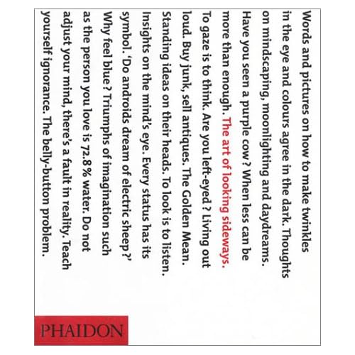
The Art of Looking Sideways is an awesome book by Alan Fletcher. I just bought a copy.

I had blogged about it earlier also on SaurabhGarg.com (on 13th Jan 2008).

This book should help me with a lot of inspiration about design, advertising, creativity, decision making and thinking. Looking forward to reading it.

And now this book becomes the second most expensive book that I have purchased after Still Reading SRK.

Other links
A vid on Youtube where Alan Fletcher talks about it.

Close Eyes, Click, Open Eyes, Guess

There is no end to what people can do. There are so many people with gifts of thought and expression. Everyone remembers the Red Paper Clip guy and the Million $$$$ Home Page. This one is up there along with those two.

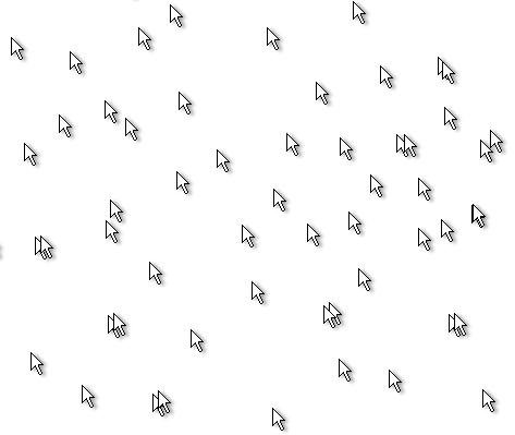
So the concept is, you load the page, close your eyes, move the mouse around, open your eyes, and guess which one of the million little mouse images is yours. I tried a few times and I was unable to locate my pointer even once. May be you will get lucky?

Close Eyes, Click, Open Eyes, Guess

And for all those lazy ones, who do not want to visit the page, here is a sample …

Ofcourse it wont work if your pointer is customized and you are using something other than the default mouse pointer (which I did when I was unable to guess my pointer after a few shots).